Credential Design Guide
How to configure the appearance of an Electronic Attestation of Attributes (EAA) so it renders correctly and legibly in the German EUDI wallet.
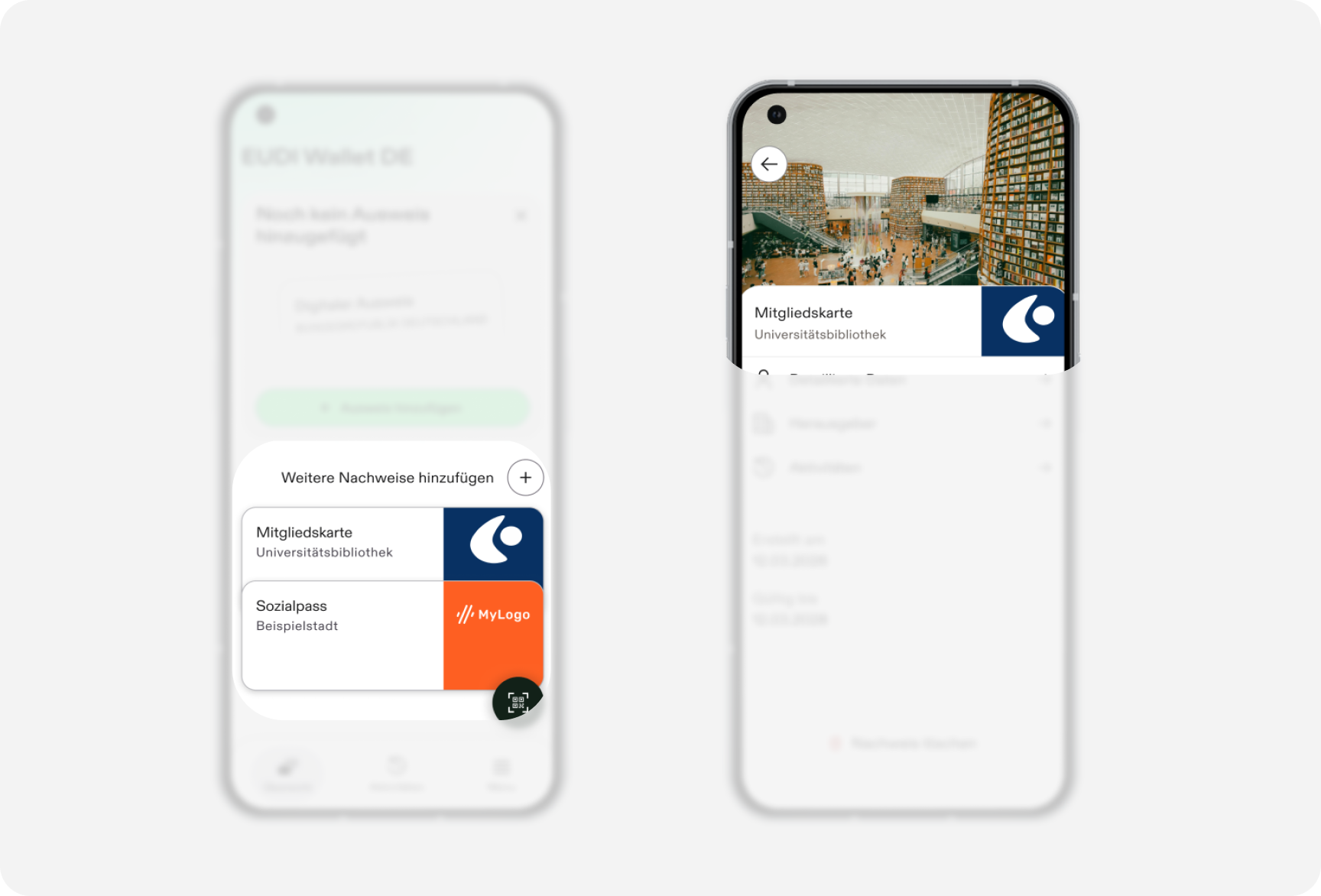
Introduction & Principles
An EAA is structured data that the wallet renders at presentation time, using the display metadata you supply. Every issuer in the wallet shares this same rendering system.
Issuer neutrality. Your credential renders alongside credentials from other issuers.
Consistency of structure, freedom of brand. The position of each element (credential name, issuer, logo, background color) is fixed by the wallet, while color, logo, and background image are where your brand identity comes through.
The wallet renders your configuration as supplied. It displays the display metadata you provide, without checking contrast, resolution, or brand fit on your behalf. Reviewing your own configuration before publishing is your responsibility, see the checklist.
What You Configure
Per the OpenID4VCI Credential Issuer Metadata model your credential type carries a language-tagged display array under credential_metadata, with the following configurable fields:
| Field | Purpose |
|---|---|
name | The credential's display name, shown on the credential card |
logo | Your logo (URI + alt text) |
background_color | Background color of the credential card |
background_image | Background image (URI + alt text), shown on the detail view (not on the credential card, see Detail Page) |
description | Not supported in the German wallet. |
text_color | Not supported in the German wallet. The wallet uses its own default text color. |
The issuer name shown on the card is derived from the registration certificate, not from display metadata.
Claim-level Display
Each individual claim (attribute) you issue carries its own metadata:
path, Required Non-empty array representing the path to a claim within the credential.display.name, the human-readable label per language. Required for every claim, in every language you support.
Credential Card
This section covers the credential card as it appears on the wallet's home screen (the detail/expanded view is covered separately in Detail Page).
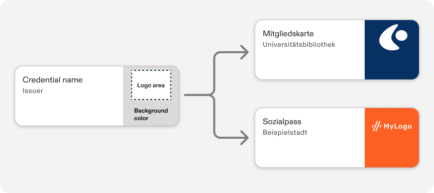
The card has four elements: credential name, issuer, logo, and background color.
| Element | Description | Specs |
|---|---|---|
| Credential name | Should make clear to the user what the credential represents, for example "Membership card," "University diploma," or "Driving licence." |
|
| Issuer | Shows which company or entity is behind the credential. |
|
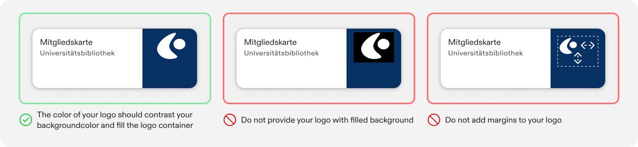
| Logo |
|
|
| Background color | The color area next to the logo that carries your brand, should support your branding while keeping the logo visible. | Fallback: light gray, #F7F7F7, if none is provided. |
Detail Page
This section covers only the top section of the detail page, the part you can configure. The lower part (the navigation rows, issue and expiry dates, and delete action) is fixed by the wallet and isn't covered here.
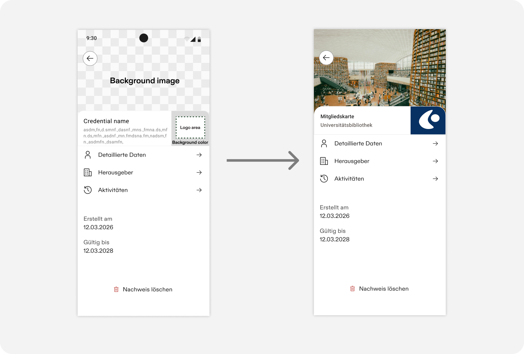
Credential name, issuer name, and logo reuse the exact same values as on the credential card (Credential Card). Credential name and issuer name get more space here, so review the different line/character limits below. Logo follows identical rules to the card. Background image has no equivalent on the card, it's specific to this view.
| Element | Description | Specs |
|---|---|---|
| Background image |
|
|
| Credential name | Same field as the credential card (display.name), with more space here. If the name was truncated on the card, more of it is visible here. | Up to 3 text lines, approximately 80 characters (versus 2 lines, approximately 45 characters, on the card). |
| Issuer name | Same value as the credential card, with more space here, derived automatically from your Access Certificate. | Up to 3 text lines, approximately 90 characters, generally enough to show the issuer name in full (versus 2 lines, approximately 60 characters, on the card). |
| Logo | Identical to the credential card. |
|
Submission Checklist
Before publishing your credential display configuration, check:
display.nameis set and reads clearly within about 45 characters, or you've reviewed how it truncates- Logo is provided at (or close to) a 4:3 aspect ratio, with alt text
- Logo is legible against
background_color background_coloris set, or you're comfortable with the#F7F7F7fallbackbackground_image, if used, is provided at (or close to) a 4:3 aspect ratio, with alt text, and doesn't embed text or use AI-generated imagerydisplay.nameis provided for every claim, in every language you support
The wallet renders this configuration as supplied. It doesn't check contrast, resolution, or aspect ratio for you, so confirm these yourself before publishing.